Wednesday, March 10, 2010
WP-2 Blogpost 1

Sunday, March 7, 2010
WP-1 Final Draft
Author’s Note:
This writing assignment was an interesting project as someone that had minor dealings in photography before. Also, thinking in a rhetorical manner isn’t something that the average person does on a daily basis and this project provided me with a great opportunity to fine tune my analytical skills and work critically. For someone who’s just beginning to take photography seriously, it becomes obvious what elements are fairly easy to control. Some of the more basic photography skills include the framing and cropping of a photo and what the lens is capturing. The framing of a photo is how the photographer can control what they want the audience to see and as Compose Design Advocate states it, “focuses your attentions on parts of a situation”. Framing a photo comes from your placement and angle from your position as a photographer in comparison to the subject matter. Analyzing photography is interesting to me because it’s an art form that anyone can pick up instantly and comprehend to some extent. In the modern-age of technology, anyone can go to the nearest Walgreens and pick up a disposable camera. When viewing photography, it’s important that you separate the argument the photographer was attempting to make and what argument the picture itself is telling you. The aforementioned concept was quite an issue for me and was the reason that I struggled so much when trying to figure out what my argument for my photo was. In photography, sometimes the person with the camera in their hand just gets lucky and takes a photo that touches on ideals that the person themselves never even imagined, but in terms of analytical analysis, you have to interpret the picture which is crucial.
After my initial draft, I felt like the concepts and rhetorical devices I stated for my picture were spot on, but that my ideas were somewhat raw and underdeveloped. One great change that John pointed out to me in peer reviews to consider was the organization of my rhetorical devices. My paragraphs concerning cropping/framing were easily my strongest arguments and I had them buried at the end of my essay rather than at the forefront where they could lead the piece off better. Something that I added between my first and second drafts was located in the paragraphs discussing coloration in that I talked about the contrast in hues of the sailor and the woman’s clothing. It’s actually quite interesting because after John pointed that out to me, I consider the bright hues of the woman’s dress and the uniform of the sailor key aspects when considering the nurturing aura of the girlfriend/wife. Upon receiving input from Josh, I realized that my introduction was in dire need of a few alterations and that I had failed to acknowledge the metaphorical value of the monument. The Tomb, like most gravesites, provides a place for grievance but is ironic to some extent because the living go to worship the dead. All in all, I feel like my essay grew drastically and now that all is said and done I appreciate the writing process a lot and have a lot more confidence in my own abilities to think in a rhetorical manner.
Final Draft:
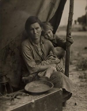
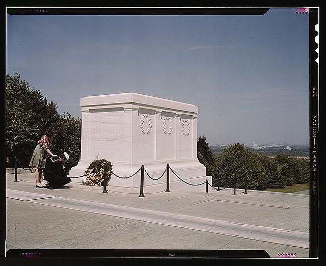
Upon the closure of World War I, the U.S. government hired a special group of photographers to document the events to come under the Farm Security Administration (later under the Office of War Administration during WWII) (American Memory). The photo was taken by John Collier and is known as "Sailor and Girl at Tomb of the Unknown Solider" and whose title barely captures the emotions this picture invokes.
In order to fully appreciate the photograph we also need to analyze its subject matter in its physical place and location in the world and all of the contexts and appeals that these traits carry along. An interesting concept about this photo in comparison to most of the others in this collection by the Farm Security Administration is that this photo is a monument that still stands today whereas many of these other photos cannot be recreated or revisited. This presents another dimension to the subject of the photo, the tomb rather than the people, because we as an audience could physically visit the Tomb of the Unknown Soldier. The photo was taken in 1919 in Washington D.C. at a time in the world when all countries and allegiances were at arms with each other with the transition from WWI into WWII (http://www.tombguard.org/history.html), all of which we have surely learned about in the history books and can try and imagine happening in our lives today but the fact that the monument still stands offers another perspective.
Sailor and the Girl at the Tomb of the Unknown Soldier was taken in order to invoke a sense of patriotism in Americans that were lost and looking for answers after the uncertainty brought on by the Great Depression, but it transformed into something much more. The photograph causes all of us, as a country, to reflect on the costs of war and whether it's worth it or not. These motifs are accomplished through such rhetorical devices such as cropping and/or framing of the photo, coloration, and vectors of attention.
The orientation and framing of this photo is as such that that Capitol Hill is backgrounded behind the row of pine trees that creates the separation between that and the foreground. The foreground is very clear and in focus drawing most of the attention to that while the background is shrouded and hazy in spots making the buildings far off in the distance less distinguishable and thus their elements are subtler. The Tomb, the sailor, and the woman are the three main elements of the photo and our eyes are naturally drawn to them due their clarity and also because of the way the photo is cropped they are several of very few elements in the photograph itself and thus we spend more attention on the specific details they entail.
For instance, the body language and positioning of the sailor and the woman influence us as the audience with appeals to pathos. The knelt position of the sailor gives us the impression that he is mourning or at the very least weakened by the sight of the Tomb and all of the memories it surely represents for him, which causes the audience to sympathize with him and the armed forces that fight for us on a daily basis. The woman, with her hand on the sailor's shoulder, is in a nurturing position and grieving just as much as the sailor but is also there in support for him and his struggles.
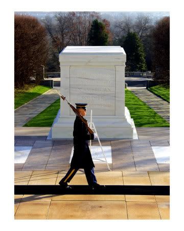
The Tomb, being the last key element of the photograph, was shot at such a specific angle and framed in the photo in a way that exemplifies its grandeur and exhibits the shear size of the monument in comparison to its two visitors and the nearby field of pine tree. The monument, though it represents for some the death that naturally follows war, stands tall and could under a different light remind people such as the soldier that those lost are never forgotten. The sailor kneeling down creates the allusion to a temple or shrine as the Tomb, and with this, the audience naturally accepts the Tomb as a place of rememberance, worship and emotions that can bring even a soldier to tears. The fact that their are only two people and such few elements of attention in the piece speaks to yet another appeal to the emotions and pathos of the picture in that it feels so desolate and isolated where this grave is placed.
The scene is very vivid and lifelike atop the hill of the monument overlooking the city. The vibrant and bold white of the Tomb resonates and immediately grabs our attention due to the contrast of the white marble to the lush green of the nearby pine trees and the sky blue of the horizon. The hue of the white is such that it is the center of attention in the photo and the first thing one notices when they view the piece. An aspect of the photo that is more subtle and may not be noticed during one's first viewing would be the the wreath located at the base of the Tomb which is ironic because the hue of the yellow flowers make them very bright which would normally dominate a photo with so many colors that are so bland yet it doesn't have that affect because of the size of the wreath in comparison the rest of the photo. The colors, while not very bright, are not overly saturated giving the photo a realistic aspect which is crucial as the photo's argument requires viewers to be able to be placed in the scene and time frame.
Another interesting aspect of the photograph in terms of coloration are the dark, nearly black, hues of both the sailor and the barriers of the tomb. Such dark tones signify mourning or defeat and depict the sailor in a down trot manner and the area as a whole as a place of grievance. Something to consider when taking note of the sailor is that he is dressed in his uniform, which speaks to his emotional connection to both his time served and the tomb before his very eyes. This value is in contrast with the attire of the woman, depicted in a plaid shirt and a skirt, both of which are of lighter colors. The dress of the woman gives the audience the impression that she has more of a carefree attitude and is present in order to support the soldier and brighten his day.
The people present in the photograph are naturally a focus as we, as viewers, seek to relate to those present at the time the picture was taken. With reflection as to how the people must be feeling, and as such it's only natural to start with their vectors of attention. Both the sailor and the woman are turned away from the camera, an aspect that is crucial to our interpretation of the picture because it places the audience in a position of an outsider looking in rather than someone at the scene and there with the couple. This in turn causes the audience to naturally empathize with them as they are simply viewing a picture taken to represent a time period and emotions that accompany it rather than experiencing the hardships themselves.
 The fact that their are only two people and such few elements of attention in the piece speaks to yet another appeal to the emotions and pathos of the picture in that it feels so desolate and isolated where this grave is placed. No solider should be forgotten, yet this one was never identified, his family never notified, and his mother left with nothing more than an MIA message from a colonel and chaplain. A monument in his honor, and for the honor of all those that never made it home, built in a field surrounded by pine trees far from the hustle and bustle of Capitol Hill.
The Tomb was built in order to honor the men and women that lay their lives down for our country and embodies all of the sacrifice that this country has been created by through a sense of isolation brought on by expert framing/cropping, contrasting hues and coloration, and simplistic elements in terms of vectors of attention. No solider should be forgotten, yet this one was never identified, his family never notified, and his mother left with nothing more than an MIA message from a colonel and chaplain that never met the man. A monument in his honor, and for the honor of all those that never made it home, built in a field surrounded by pine trees far from the democracy of Capitol Hill.
Works Cited
American Memoryhttp://memory.loc.gov/fsowhome.html>.
McIlvenna, Gavin. History of The Tombhttp://www.tombguard.org/history.html>.
